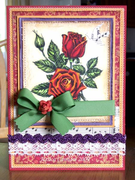
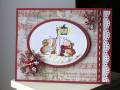
{please click on the link to my blog below to see the Country Living photo, thanks!}
I was really inspired by the gorgeous autumn colors in this Country Living vignette and knew I had the perfect idea for my newest (to me) stamp. The combination of plum and orange was intriguing to me and a real challenge to translate them into a card. In the end, just a touch of plum seemed to be just the right amount of contrast. There's more green in my card than in the Country Living photo, but it just seemed right and I really like the results.