Registered: December 30, 2004 Location: Where ever I go...there I am! Posts: 64166
Thu, Jan 05, 2006 @ 7:16 PM
Honesty thread: I liked this but I'll admit you have better cards, I mean you're a pro at this card making! What if you added some ribbon through the window just on the top panel, left side. That could do it!
Splitcoast Dirty Dozen Alumni Splitcoast Gallery Moderator
Registered: July 19, 2004 Location: Colorado Posts: 24169
Thu, Jan 05, 2006 @ 7:59 PM
Honesty: A little ribbon? Somehow the dragonflies are getting lost (but that might be scanner), not sure what to do about that though. Love the design.
Registered: December 22, 2004 Location: Atlanta Baby!!! Posts: 2289
Thu, Jan 05, 2006 @ 9:04 PM
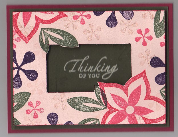
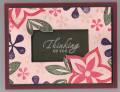
BH Thread - being honest, I love the layout, neat idea...I just am not a fan of the colors. Blush blossom is just so "blah" I would do this in bright colors like pinks and purples and bright greens...
colleen
------------------------------ Colleen Schaan - Education Specialist at Imagination International Inc.,/Copic Marker
Blog - Distinctive Touches;My Copic Books!
Registered: May 2, 2004 Location: Far, far away Posts: 24216
Fri, Jan 06, 2006 @ 2:00 PM
Honesty: Love the colours, love the design, leave off the dragonflies - didn't even see them until someone else mentioned them. but that could be the scan. Either way, I think they'd detract from the great popping flowers! Great job!
Registered: August 21, 2005 Location: Beautiful New England Posts: 1145
Fri, Jan 13, 2006 @ 12:42 AM
Honesty thread: I think it is the scan, but the colors look too dark for the images. Also maybe the scan, but I never even saw the dragonflies until someone mentioned them.