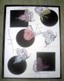
Made this for a friend's birthday. I love this set. It is very versitile can't wait to do more with it
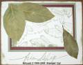
I used SU Pastels & blender Pen to color image, the inks listed are for the background.
Date: Saturday, September 24, 2005 GMT Views: 681
Favorited:6
Registered: November 18, 2004 Location: Ohio Posts: 4981
Fri, Jan 06, 2006 @ 4:34 PM
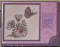
Honesty Thread: Mary, your coloring and polished stone background are really nice. The only thing I can think of is that the corner punch and the eyelets seem to not work well together, maybe are detracting from each other?? Or else it's the placement of the eyelets. Maybe they'd look better in a row like that, but just under the words? I really like this though!
Registered: October 9, 2003 Location: Eaton Rapids, Michigan Posts: 1282
Fri, Jan 06, 2006 @ 4:59 PM
BH thread - awesome card, Mary! I really like it! I agree about the placement of the eyelets... move the words up so they're centered over the background stamp and placed the three eyelets underneath that.
Splitcoast Dirty Dozen Alumni Splitcoast Gallery Moderator
Registered: July 19, 2004 Location: Colorado Posts: 24169
Fri, Jan 06, 2006 @ 5:12 PM
Honesty -- ditto what Nicole said. I'm not sure about the corner punch either, but moving the eyelets may solve that. Great job on that technique (it is one of my favorite techniques)!
Registered: May 2, 2004 Location: Far, far away Posts: 24216
Sat, Jan 07, 2006 @ 1:23 AM
Honesty thread: I like the way you used the corner punch in just one corner - that way it doesn't overpower the card. I agree that the eyelets might be a bit much; they're v close to the edge - how did they not fall off the edge? I like the colours as they are but agree a bit of green somewhere would really make it zing!
Registered: November 6, 2003 Location: Omaha Posts: 3430
Wed, Jan 11, 2006 @ 8:32 AM
honesty thread: i think you did a beautiful job on this card! I agree that they eyelets and the punch kind of compete with eachother and the sentiment could be centered over the shadow. AWESOME card!