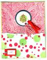
just a fun christmas card. when i started making it it wasn't supposed to be a christmas card, i had used a flower on the tag instead of a tree but when i stood back and looked at it it looked to "christmassy" (is that a word?) so i flipped the tag over and used the tree instead
Date: Monday, September 26, 2005 GMT Views: 627
Favorited:5
Registered: July 29, 2005 Location: Stampin' with the new rubbah the posse sent me!! Posts: 8734
Wed, Jan 11, 2006 @ 12:08 PM
BH: The only suggestion I would make is to move the sentiment into the middle/left of the lower section to balance it a little more. Maybe about an inch higher.... I would also suggest a certainly celery "border" between the paisley and the dots to break up the field a little. The two "busy" sections will then stand out separately instead of being right on top of each other. Love the color combo and the layout!
------------------------------ "If toast always lands butter-side down, and cats always land on their feet, what happens if you strap toast on the back of a cat and drop it?" -Steven Wright
Registered: May 2, 2004 Location: Far, far away Posts: 24216
Wed, Jan 11, 2006 @ 1:11 PM
BH: Love the dotty background and the colours! I'm not a fan of the Paisley background - gasp! - so it might just be me, but I think the tree would stand out more if the top half of the card was just plain, but maybe layer a torn edge of red behind the spotty layer. But don't forget I'm biased against the Paisley!! ;)