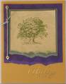
My friend would like some suggestions on this card. It's for our fall card swap. We're supposed to keep it simple. Maybe adding a different color for the leaf?
I think she came up with a really neat idea, don't you?
Date: Friday, September 30, 2005 GMT Views: 654
Favorited:5
Boy, I don't know....I think it looks great as is! If the word of the day is "simple," then I think this is perfect! It may be simple, but there's a LOT going on to please the eye. Don't change it, that's my vote...
I like it -- nice balance. I do like the suggestion of adding color to the leaf - it is fine without it, but maybe a simple watercolor (not for detail, just rough brush over) in a fall color - pumpkin maybe - would add some additional interest if looking for something else to add. maybe dimensional under the leaf, but again, not necessary. i also might try how it looks to do the canvas and lovely as a tree in different colors for a different look - like caramel for the background and then chocolate chip for the trees for a little more contrast - but I like the tone on tone too - just would have a different look. Either way, I would be pleased to get this card!
Registered: March 2, 2005 Location: Wildwood, GA Posts: 1336
Fri, Sep 30, 2005 @ 6:01 PM
I like it just the way it is! It's simple, but also have a very finished and nice look. This would definatly be a card I'd give to a friend! Way to go!
Registered: July 5, 2004 Location: San Antonio, TX Posts: 3711
Fri, Sep 30, 2005 @ 6:08 PM
I really like this card myself. I wouldn't change it
------------------------------ Laura H. - Stampin Up! Demo since July 2004 My SU siteMy GalleryFind me on Facebook Stampin' - So easy a caveman could do it!
Registered: February 16, 2005 Location: Elgin, IL Posts: 4489
Fri, Sep 30, 2005 @ 6:34 PM
since feed back was requested... I think the background is super cool... I love the idea of layering an image with this background stamp. And the torn window with the saying, awesome. I don't think the leag is nessesary even... you could just remove it and it would be done looking. If you do leave it, I would add color to it. Looks Good though! I would be happy if I had it in my swapping hands!
Registered: March 5, 2004 Location: Kernersville, NC Posts: 268
Fri, Sep 30, 2005 @ 6:44 PM
I like the more monochromatic color scheme she has done. If she wants to "pop" it maybe as a previous poster mentioned more color on the leaf or just take it off. It is nice the way it is though and I would love to case it.
Registered: November 4, 2004 Location: West Chester, PA Posts: 820
Fri, Sep 30, 2005 @ 7:01 PM
I really love this card! Maybe, and I mean MAYBE if you really wanted to add something, I'd do the trees a bit darker, or stamp off the canvas first--just a bit more contrast. And I agree you could also leave off the leaf if you felt like it. But I love the twig and twine look, and the window. I would love to make this card!
Great work!
Registered: January 14, 2005 Location: Posts: 7516
Fri, Sep 30, 2005 @ 8:21 PM
This is a great fall card! If she really wanted to change it, maybe adding another set of trees, slightly off the ones she has, in artichoke or rust would be nice. But I like it either way!
Thank you for the nice words and the advice. You are so kind.
I restamped the trees and Oak leaf cut out with Close to Coca. It remains subtle. This card is meant to provide encouragement. Inside is stamped "Wishing you happiness," also from Summer by the Sea. I am still considering adding that splash of color. When it's done, I'll see if I can't get my friend and stamping mentor to replace the image. Thanks oodles and oodles.