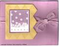
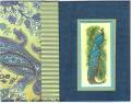
I've challenged myself to making a card from each of the color coach coordinating color suggestions. This is their idea for pretty in pink. I would never have put these colours together, and probably never will again.
Date: Tuesday, February 7, 2006 GMT Views: 1257
Favorited:31
Additional Info
Stamps: Gently Falling, Canvas, Harlequin
Paper: pretty in pink, saffron, perfect plum, vanilla
Registered: August 25, 2004 Location: Bedford, Texas Posts: 374
Tue, Feb 07, 2006 @ 1:15 PM
Why not?!?!? I think the colors are really striking!! Love the diamond cuts, too.
Linda
------------------------------ Visit my gallery: https://www.splitcoaststampers.com/gallery/showgallery.php?cat=500&ppuser=68210
Visit my blog: http://www.hugsincluded.blogspot.com
Registered: January 7, 2004 Location: Pensacola, Florida Posts: 2170
Tue, Feb 07, 2006 @ 3:26 PM
I'm always amazed at the colors they choose, but once created with a piece of art.. they look great. Your card looks awesome and love what you did with that print pattern bg.
------------------------------ Kimberly Van Diepen, Licensed Mental Health Counselor by day, paper crafter at night!