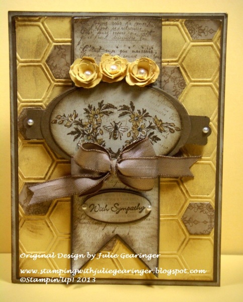
I wanted to create a card using the Create with Connie and Mary CCMC252 Colors and incorporated them with the Splitcoaststampers SC433 Sketch Challenge and decided to use one of my favorite soon-to-be retired sets, Nature's Pace.
If interested, I have free detailed instructions on My Blog
Thanks again for looking- have a marvelous Monday!!
Date: Sunday, May 19, 2013 GMT Views: 3946
Favorited:20
Registered: January 11, 2009 Location: Melbourne, Australia Posts: 81
Mon, May 20, 2013 @ 2:24 AM
I would never have guessed that yellow and brown could look pretty together. Here in Melbourne, Australia, we have a football team whose colours are yellow and brown, and not at all attractive - this on the other hand is very nice!
The white gel pen details on the flowers and little bee really enhance the images.
------------------------------ Find me at Sarah B's Creative Corner on Facebook and Pinterest.
Splitcoast Dirty Dozen Alumni Creative Crew SU Design Team Alumni
Registered: October 5, 2006 Location: Maryland Posts: 15782
Mon, May 20, 2013 @ 3:25 AM
Thanks Sarah!! I normally would not pair these colors together but that is what I like about color challenges :-) Thanks again for taking the time to make my day with your sweet comments :-)
Registered: February 26, 2013 Location: Puerto Rico Posts: 525
Mon, May 20, 2013 @ 5:54 AM
This is so beautiful. So many details were put into the card. The die-cut kraft paper hexagons glued to the embossed background are a fine touch. Great job toning down the yellow for a more neutral, subdued palette. I'm happy I saw the white gel pen detailing. I'd love to do that, and this is fab inspiration on how to.