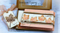
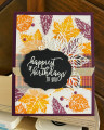
These colors were a mega challenge for me - not gonna lie - that's why you almost need to zoom in to see the petal pink - but it's on there and it's also dots! The background has dots of petal pink. I liked the copper with these colors. I'm not gonna tell you how many takes it took me to get this one that I'm okay with. They don't call it a challenge for nothing!! I am anxious to see what everyone else comes up with in these colors - and I will go Oh, duh!!! Happy Tuesday everyone!!
Date: Monday, November 15, 2021 GMT Views: 1570
Favorited:0
Splitcoast Dirty Dozen Creative Crew SU Design Team Alumni Splitcoast Challenge Hostess
Registered: November 28, 2004 Location: St. Paul, Minnesota Posts: 11240
Mon, Nov 15, 2021 @ 7:42 PM
This turned out beautifully but I'm sorry I caused you trouble...I'm so glad you added copper. I had some pulled out but it just didn't seem to fit where I was going. I do confess I picked these while I was away from my stamp room. Usually I play around with various combinations but this time I didn't.
Registered: October 12, 2007 Location: Arizona Posts: 70555
Mon, Nov 15, 2021 @ 7:46 PM
The copper does look fantastic with these colors! Excellent idea. Using the two colors on the leaves is so unique and beautiful. The peachy-pink in the background adds a lovely softness. Love the wonderful texture. Great card!
Karen, I feel your pain. I had to scratch my head for a while to come up with a project using these colors. Your card is absolutely stunning and I did see your petal pink dots when I looked close. The die cut leaves are my favorite element. I love this card!
Registered: June 9, 2006 Location: Wauconda, IL Posts: 55667
Tue, Nov 16, 2021 @ 5:06 AM
Well Karen, my eyes go directly to your card. Flowers and leaves are my favorite. You may have struggled with this, but the outcome is terrific!! Wishing you and your family a wonderful Thanksgiving!! :>)
Splitcoast Dirty Dozen Creative Crew SU Design Team Alumni
Registered: May 18, 2004 Location: Southwest Michigan Posts: 37094
Tue, Nov 16, 2021 @ 10:14 AM
It's a lovely combination of stamped and die cut leaves! I love the coppery twine crossing the main panel and the pearls. I had a struggle with these colors, too, plus I have no Cinnamon Cider ink or cardstock. For me, the color challenge is usually the most challenging!
------------------------------ Claudia Splitcoast Fan Club Member
Registered: August 21, 2007 Location: Wayland MA Posts: 105268
Tue, Nov 16, 2021 @ 10:19 AM
I am a real fan of copper. Your card is lovely, and made lovelier with the copper cord, mf!
------------------------------ Anne HarmonFS154, QFTD58, PROUD FAN CLUB MEMBER (photo of our Great Granddaughter Elise, just 6 months old) and me, even older.
Registered: February 27, 2007 Location: LaCrosse, Wisconsin Posts: 39698
Tue, Nov 16, 2021 @ 10:36 AM
Copper is a big duh for me...that makes a wonderful difference. I didn't think we should add metallics unless they're part of the color trio. this is beyond gorgeous and I will fave it. Well done!
------------------------------ Jean Bean the Dancing Queen "You can play a shoestring if you're sincere." -John Coltrane