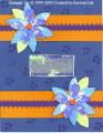
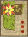
I'm so challenged with perfect petals. I tried chalks & I had horrible results. This is the best coloring I could get with the flower. The lace background is also gaudy... The more I see the card, the more I hate it... Any pointers on how do I get the "perfect petals" flowers to look like flowers????
Date: Monday, March 28, 2005 GMT Views: 1397
Favorited:5
Registered: December 3, 2004 Location: Blanchard, Idaho Posts: 5253
Mon, Mar 28, 2005 @ 12:32 PM
I love this card, but I, too had trouble with those 'stipply' sets. I have both Perfect Petals and Nature's Wonder. Then I used the Basic Brown stamp pad and Sharpie pens. I can't upload the card I made as I have already sent it to the person it was for, but I truly loved the look. HTH
I don't think that it is awful, you have a great concept, but you could tome the back ground (maybe) by trying all one color, so that your petal flower will stand out more, it really blends with the background. I too sometimes have trouble, wit the color schemes, but I think the flower color is fine, but you need the megenta in the back ground color in the square under the flower and maybe mauve, that would make the flower jump out, I think. Just a thought.
Another option would be to make the bottom layer of the flower larger so that the background would look more like a frame. The solid color of the larger bottom layer would work like a mat. You can get a rough idea of how that would look by copying the photo into graphics software and editing it. I tried that before posting this, and liked the effect.