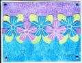
This is my submission for this week's color combo. I had to darken the photo so the leaves would look green. I just can't get that green to look like it's supposed to! Maybe because of the brads? I stamped a greeting at the bottom with white permanent ink, but it didn't show up and I just sponged over the area with more of the turquoise. Do you think I should leave it as is, or stamp a greeting in black? I don't have white craft or white ep. Lemme know what you think.
Date: Wednesday, September 7, 2005 GMT Views: 1469
Favorited:24
Registered: April 20, 2005 Location: The only Eaton Rapids on the Earth, Michigan Posts: 57568
Wed, Sep 07, 2005 @ 12:52 PM
I was really drawn to the colors in your card---so pretty! I, too, would probably choose the black ink for the greeting. This one is going into my favs!
Registered: May 1, 2005 Location: Mostly near Cincinnati but Gulf Shores, AL in the wintertime 😎 Posts: 945
Wed, Sep 07, 2005 @ 3:54 PM
I love your colors and layout! So bright and cheerful. As for a sentiment, you could stamp with black on a strip of vellum(cut or torn) and attach it with the bottom 2 brads. But it's beautiful just as it is too! ~TFS~
------------------------------ "God is good, all the time. All the time, God is good!"
Registered: December 21, 2004 Location: Kentucky Posts: 1875
Wed, Sep 07, 2005 @ 7:23 PM
WOW . . . what a cool background! The whole card is great. Maybe a dark purple or royal blue colored greeting would work. Or just leave it alone and write on the inside!!!
Registered: February 12, 2005 Location: California Posts: 660
Wed, Sep 07, 2005 @ 9:40 PM
The colors are very pretty! I like the two-tone top to bottom design with the row of flowers helping with the transition to the bottom of the card. Not sure if a white craft pad sentiment would show up. I have one, but haven't used it yet. Should try it on something like this to see if it'll work. I don't think I'd use black for the sentiment. White EP would work... too bad I can't hand you some through the screen