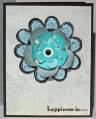
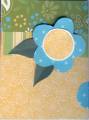
And may I say that her card came out far better than my attempt!! LOL! While I'm not convinced that all these colors go together, I do like many features of the card. For full instructions, check out my blog here: http://divamomconfessions.blogspot.c...-card-was
Date: Sunday, April 22, 2007 GMT Views: 355
Favorited:2
Additional Info
Stamps: Big Blooms, Well Worn Words
Paper: Basic Black cardstock; Jenni Bowlin Journaling paper
Ink: Tim Holtz Paint Dabber, Buckaroo Blue, Tempting Turquoise
Registered: September 21, 2004 Location: Minglerville, Michigan Posts: 69914
Tue, Jul 10, 2007 @ 4:59 PM
Well, I like the colors! The flower is so interesting - the layers have such depth! And I love the look of the base paper - it has such an interesting appearance. I think it's a great card! TFS!