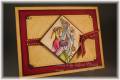
What is WRONG with this card? This is my first attempt at this set, I desperately need to come up with something (actually TWO somethings!) for a swap, and I'm just stumped. I started by coloring in the angel, then kinda built my card around that. I'm not loving the colors, the flourish needs to move a bit (and I think the stamp was dirty... ewww!), and the colors ran a bit when I applied 2-Way Glue behind the angel (I'll fix that in later runs). What would you do to change/improve this one?
Date: Tuesday, August 21, 2007 GMT Views: 2052
Favorited:7
Additional Info
Stamps: Holy Triptych, All Holidays, Baroque Motifs
Registered: September 22, 2005 Location: Toronto Posts: 717
Tue, Aug 21, 2007 @ 7:50 PM
I think it's quite lovely as it is, but if you're concerned maybe move the flourish up a little higher so you can move the the angel up a bit more too? That way it won't be so bottom heavy......
------------------------------ Carol, mom to GB, E-man and Courters My Tiny little Gallery
I think it is a nice design, but since there is no other dark purple in it, maybe use the lighter purple for the bottom and just the ribbon to divide the two,no strip. Also since both of those are cool colors maybe try the silver embossing instead. hope this is helpful, i know how frustrating it is when I am not satisfied with my colors.
Registered: January 19, 2005 Location: Minot, North Dakota Posts: 3520
Wed, Aug 22, 2007 @ 3:34 AM
The angel is really lovely. I think it might be the background colors. The blue doesn't seem right - maybe too bright, but that may be my monitor. How about using Amethyst for the upper layer instead?
Registered: September 6, 2004 Location: MA Posts: 2152
Wed, Aug 22, 2007 @ 4:09 AM
I would change the bashful blue to amethyst, staying with the purple hues. In my opinion it will flow better. I would also change the gold to silver. Everything else about your card is awesome! The layout is beautiful! Hope you post your revised card so we can see what changes you decided on.
Registered: April 8, 2006 Location: In my own little bubble.... Posts: 4256
Wed, Aug 22, 2007 @ 11:30 AM
I agree with other posters. Move the flourishes up and even the angel up...and consider switching out the eggplant for a lighter color...but it is REALLY pretty and almost makes me want to buy this set...
Registered: December 13, 2004 Location: washington! Posts: 25910
Wed, Aug 22, 2007 @ 12:02 PM
How about using Burgundy or Eggplant? This stamp set seems to be the elegant type, requiring deeper richer colors....Just my .02!!
I LOVE this set though, and am torn on getting it!! Super layout!!
Registered: October 18, 2006 Location: BC Canada Posts: 5579
Wed, Aug 22, 2007 @ 4:05 PM
I would move your division line down too... so it's more in a space of thirds... easier on the eyes even if you don't know why. And I would maybe try a piece of PP on top in a light scheme, or a background stamp that is'nt so dominate. You want your angel to shine and she is so pretty
------------------------------ WAHM to almost 5 year old twins boys My blog
Stamp to Spend Earned: $371.00 Spent: $613.00 ~
Registered: March 8, 2005 Location: Ontario Posts: 1489
Wed, Aug 22, 2007 @ 6:57 PM
I really like your layout and your card but I always prefer silver with blues and purples over gold. So I think that subtle change would help your colours flow together. But I think the card is great and perhaps one of those ones you should leave on your desk for a day or two and then go back and look at and then you'll find you like it.
------------------------------ Shielded by the Shepherd
For I am convinced that neither death nor life, neither angels nor demons,neither the present nor the future nor any powers.....will be able to separate us from the love of God that is in Christ Jesus our Lord. Romans 8:38,39
Registered: August 29, 2007 Location: Lake County Florida Posts: 2033
Thu, Sep 13, 2007 @ 6:15 AM
LOVE DAUGHTRY!!
Now on to the card! It's pretty. I agree with the others above. And you could try to do the angel in black so she stands out more. Or, remove the eggplant and put the ribbon on top of the light purple strip.
OR try making the base and your angel's layer the same and use the dark purple as your strip.
I have a lot of ideas for this set. I will shut up now.
I can't wait to get this set. It is really nice.
------------------------------ Marji(Tigger, My Love 1988-200 My Blog My Gallery
Registered: September 7, 2007 Location: Miamisburg, OH Posts: 43228
Sat, Oct 06, 2007 @ 7:11 AM
Your angel is the softest prettiest angel I have seen with this set!! JUST GORGEOUS!! I think if you take OUT the eggplant on this card it would flow better and maybe tone down the blue by putting subtle background on it - like more flourishes....stick with your beautiful angel EXACTLY like she is and try her on different backgrounds that are more subtle. Your angel is so so pretty, and though I do like silver with those colors TOO, I LOVE gold with soft blue and lavendar....DON'T CHANGE YOUR ANGEL!!