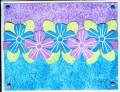
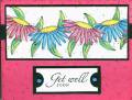
This is my submission for this week's color combo. I had to darken the photo so the leaves would look green. I just can't get that green to look like it's supposed to! Maybe because of the brads? I stamped a greeting at the bottom with white permanent ink, but it didn't show up and I just sponged over the area with more of the turquoise. Do you think I should leave it as is, or stamp a greeting in black? I don't have white craft or white ep. Lemme know what you think.
Date: Wednesday, September 7, 2005 GMT Views: 1467
Favorited:24
Splitcoast Dirty Dozen Alumni Creative Crew SU Design Team Alumni
Registered: October 29, 2004 Location: Coos Bay, Oregon Posts: 24007
Wed, Sep 07, 2005 @ 11:30 AM
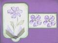
I love your waxpaper resist and your cutout flowers. You could use black for a greeting. I use Stazon jet black for sentiments. It really pops. Your card also looks great as is. TFS. Nancy