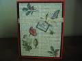
This card is for F4A65 challenge: Opposites Attract...to use colors that opposite each other on the color wheel. My colors are red-Violet vs. Yellow green
I started by inking my lattice folder with Old Olive and then running the cream cs thru for the 2 tone look. The lavendar lace card base in my picture looks blueish, but in real life its more purple.
The script from Botanicals was inked in Crumb Cake and then sponged on the edges and the botanical flower was stamped on top and colored with a mix of aqua painter and blender pen.
For my label, I punch an entire piece of cream with the decorative label punch and then turned it upside down and punched it again for a skinnier label.
Thanks for Looking!
Mary Beth
Date: Friday, May 20, 2011 GMT Views: 3051
Favorited:33
Registered: January 11, 2010 Location: Miamisburg, OH Posts: 7227
Fri, May 20, 2011 @ 9:10 AM
Your card is just BEAUTIFUL!!! I LOVE that image! The script is just perfect!! WHat a beautiful, beautiful card you've created!!!~
------------------------------ "Art is the most intense mode of individualism that the world has known." � Oscar Wilde
My Blog: http://jennabeecrafts.blogspot.com/
Registered: July 9, 2008 Location: Stars Fell on Alabama Posts: 74893
Fri, May 20, 2011 @ 9:50 AM
Love your color choices and that beautiful flower. Outstanding creation!
------------------------------ My Blog---My Gallery---My PinterestI'm a Punchkateer! (Prez) FOREVERDirty Dozen Alumni2014 CAS Spring DT--- Inspiration Challenge Co- Hostess 12/02/17-12/28/19 Watercolor Wednesday Design Team Hebrews 13:2Brenda